Card Grid
A card grid section is defined by adding the class cards to a Markdown Heading. For instance,
## Card Grid Example {: .cards} ### Rose (Rosa spp.)  Classic symbol of love; thousands of cultivars give you every hue from velvety reds to delicate pastels, plus modern disease‑resistant shrub types. ### Peony (Paeonia spp.) [](#)  Huge, ruffled blooms in late spring; intoxicating fragrance and a palette that ranges from blush pink to rich burgundy. ### Orchid (family Orchidaceae) [](#)  Exotic architecture and intricate patterns; genera like Phalaenopsis are now easy to grow indoors and bloom for months. ### Tulip (Tulipa spp.) [](#)  Icon of spring gardens; single, double, fringed, or parrot forms in nearly every color—even dramatic two‑tone “Rembrandt” streaks. ### Dahlia (Dahlia spp.) [](#)  Summer‑to‑frost fireworks with dinner‑plate giants, pom‑poms, cactus types, and new “café au lait” pastel cultivars popular in bouquets. ### Hydrangea (Hydrangea macrophylla & relatives) [**Hydrangea** (*Hydrangea macrophylla* & relatives) ](#)  Show‑stopping mophead or lace‑cap clusters; soil pH trick lets you shift some varieties from pink to blue.
The use of the cards class formats children sections as cards in a responsive grid. The number of cards displayed in each row depends on the horizontal width of the page. At the default page width only 3 cards would be displayed horizontally (or only 1 on a phone-size device). Note that page widths may be increased from their default size by setting the max-width property in the site _config.yml or in the page front matter section. The max-width is set to a pixel size (such as 1200px) or to full, which allows the page to use the full width of the browser.
A card is defined in section that is a direct descendent of the section defined with the cards class. The card created from each section will include an image, title, and content.
- The card title is derived from the section heading. If a stand-alone link (not part of a paragraph or list) is found in the section, the title will be linked using the URL from the link element.
- The card image is defined by a Markdown image tag in the section. The URL for the image may use the Wikimedia Commons short-hand notation.
- The card content is defined by any other paragraphs or lists present in the section.
Card Grid Example
Popular Flowers

Classic symbol of love; thousands of cultivars give you every hue from velvety reds to delicate pastels, plus modern disease‑resistant shrub types.

Huge, ruffled blooms in late spring; intoxicating fragrance and a palette that ranges from blush pink to rich burgundy.

Exotic architecture and intricate patterns; genera like Phalaenopsis are now easy to grow indoors and bloom for months.
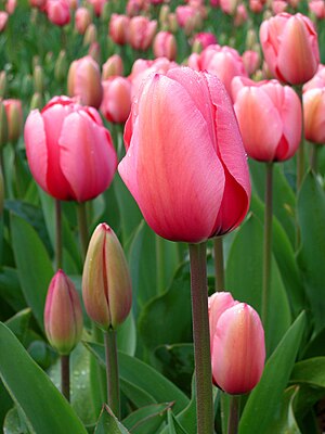
Icon of spring gardens; single, double, fringed, or parrot forms in nearly every color—even dramatic two‑tone “Rembrandt” streaks.
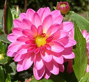
Summer‑to‑frost fireworks with dinner‑plate giants, pom‑poms, cactus types, and new “café au lait” pastel cultivars popular in bouquets.

Show‑stopping mophead or lace‑cap clusters; soil pH trick lets you shift some varieties from pink to blue.